

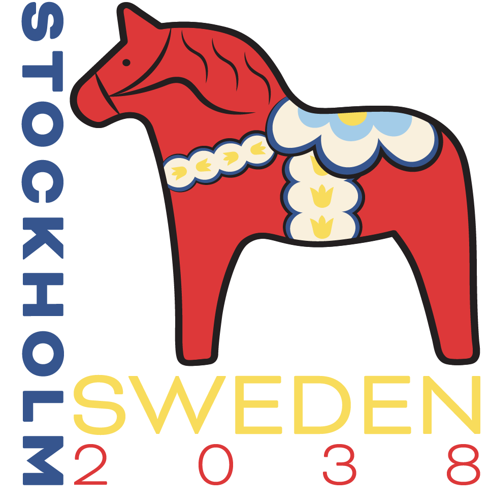
For this project, I created a full branding concept for a hypothetical 2038 Winter Olympics hosted in Stockholm. The objective was to design an identity that captured the international energy of the Olympic Games while also celebrating the unique culture and visual traditions of Sweden. I wanted the branding to feel bold, memorable, and modern, while still being rooted in authentic cultural inspiration. To begin the process, I researched Swedish history, folk art, architecture, national symbols, and traditional color palettes to better understand how those elements could be translated into a contemporary design system.
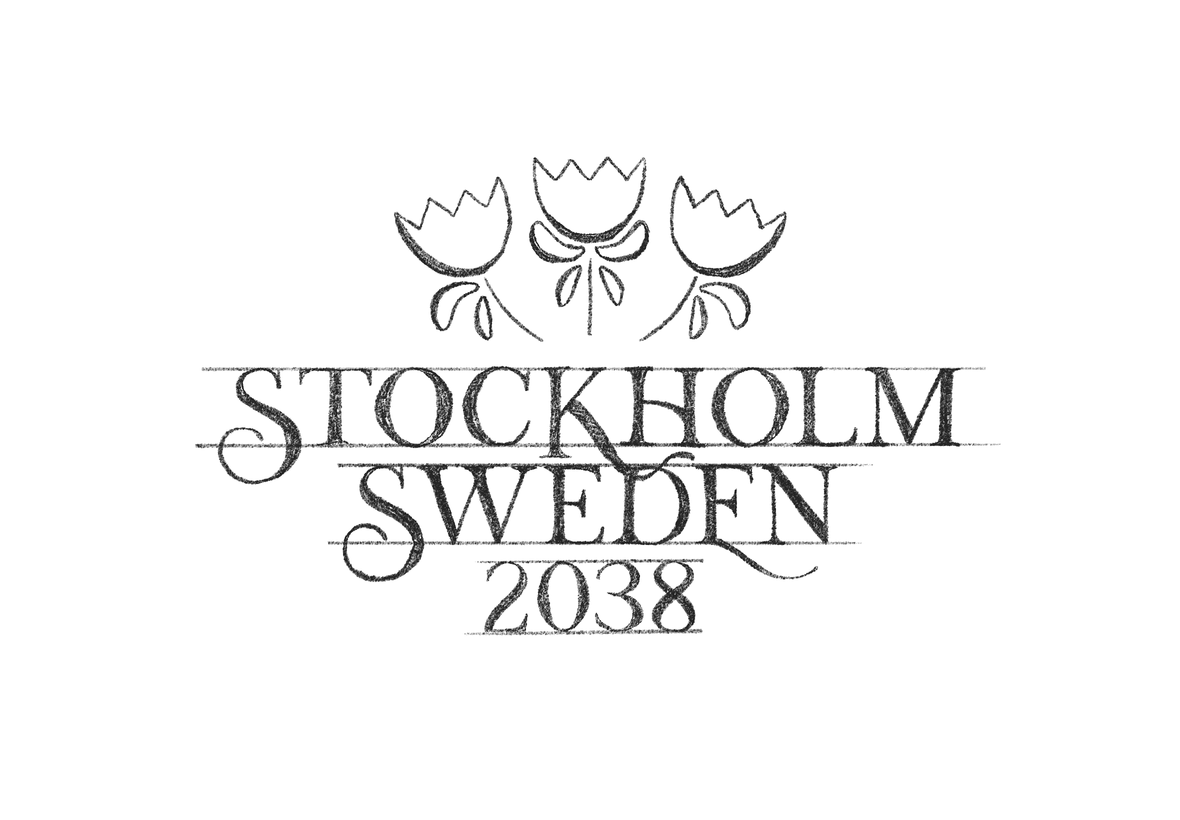
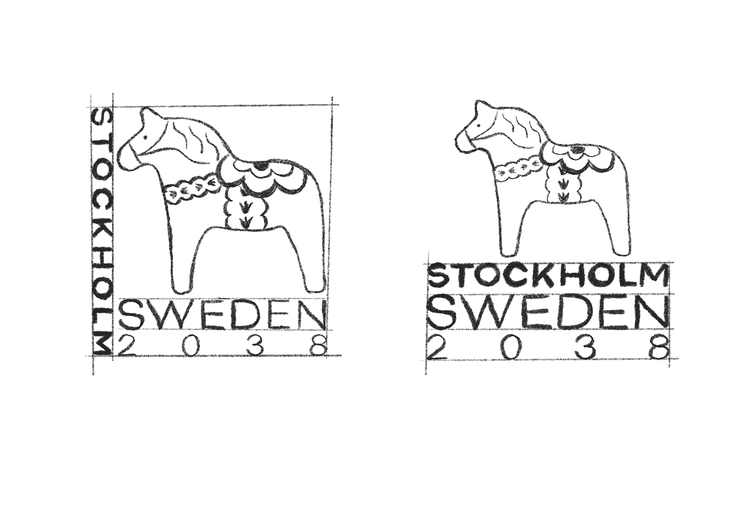
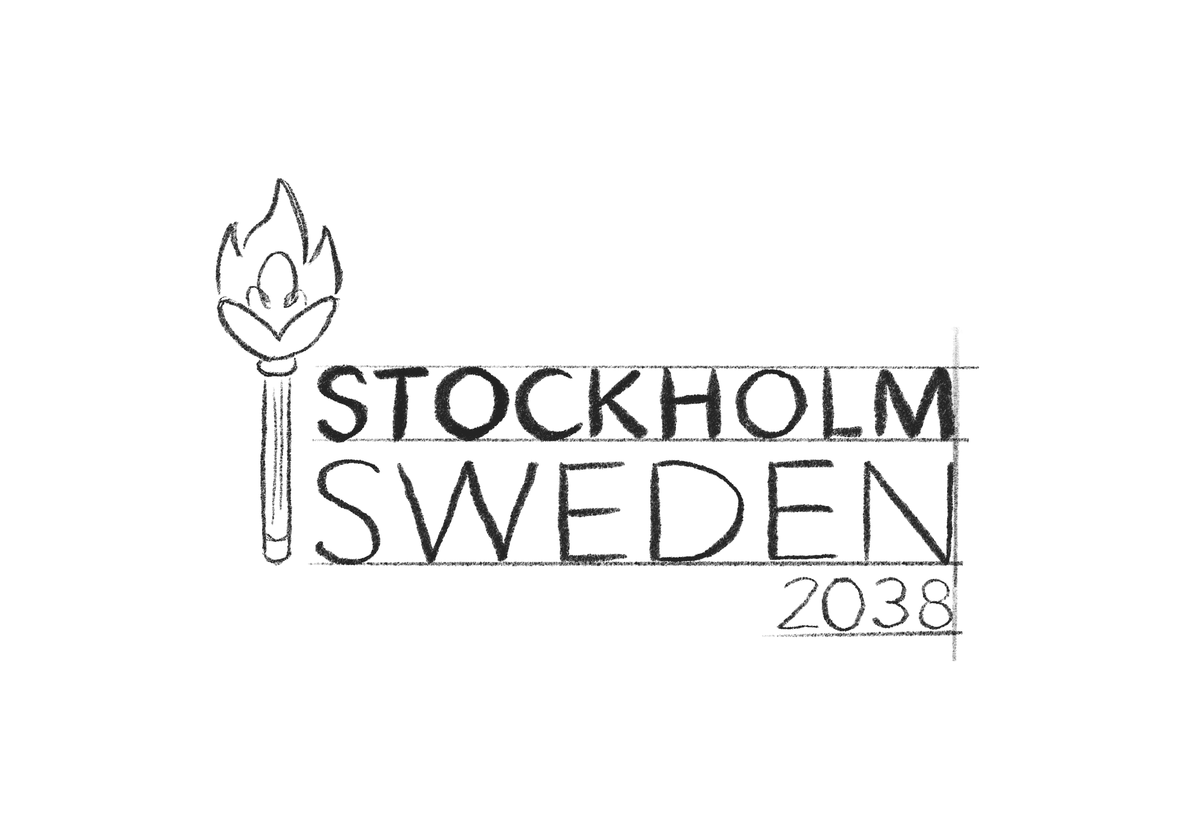
During the concepting phase, I explored multiple directions inspired by Swedish identity. Early ideas included references to traditional floral motifs, winter landscapes, Scandinavian minimalism, and Olympic symbolism. Through sketching and digital experimentation, I narrowed the strongest concepts down to three final logo directions. Each concept approached the project differently, with some leaning more modern and geometric, while others focused more heavily on traditional decorative influences.
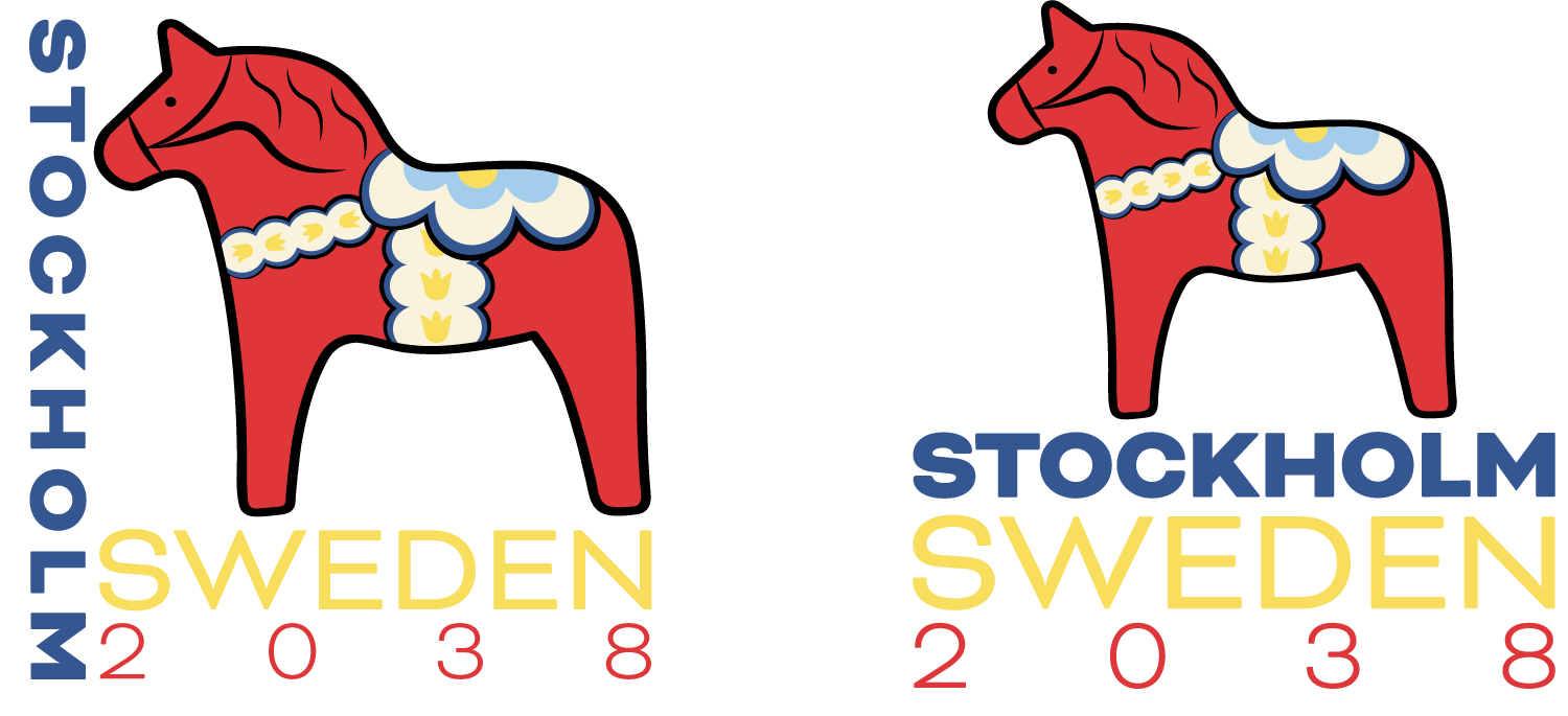
The final selected concept centered around the iconic Dala horse, one of Sweden’s most recognizable cultural symbols. Traditionally associated with strength, resilience, and good fortune, the Dala horse felt especially fitting for the Olympic spirit. Its silhouette is instantly recognizable, making it a strong foundation for a logo that needed to feel memorable at both large and small scales. I simplified the form while preserving its traditional character, then integrated decorative pattern details inspired by authentic hand-painted Dala horse designs.

Color played an important role in creating the final identity. I used a palette inspired by traditional Swedish folk art, featuring bold reds as the dominant color with accents of yellow and blue. These colors also connect naturally to Sweden’s national identity while creating a vibrant and energetic presence. To balance the detailed illustration, I paired the mark with clean typography that feels modern, legible, and supportive rather than overpowering.
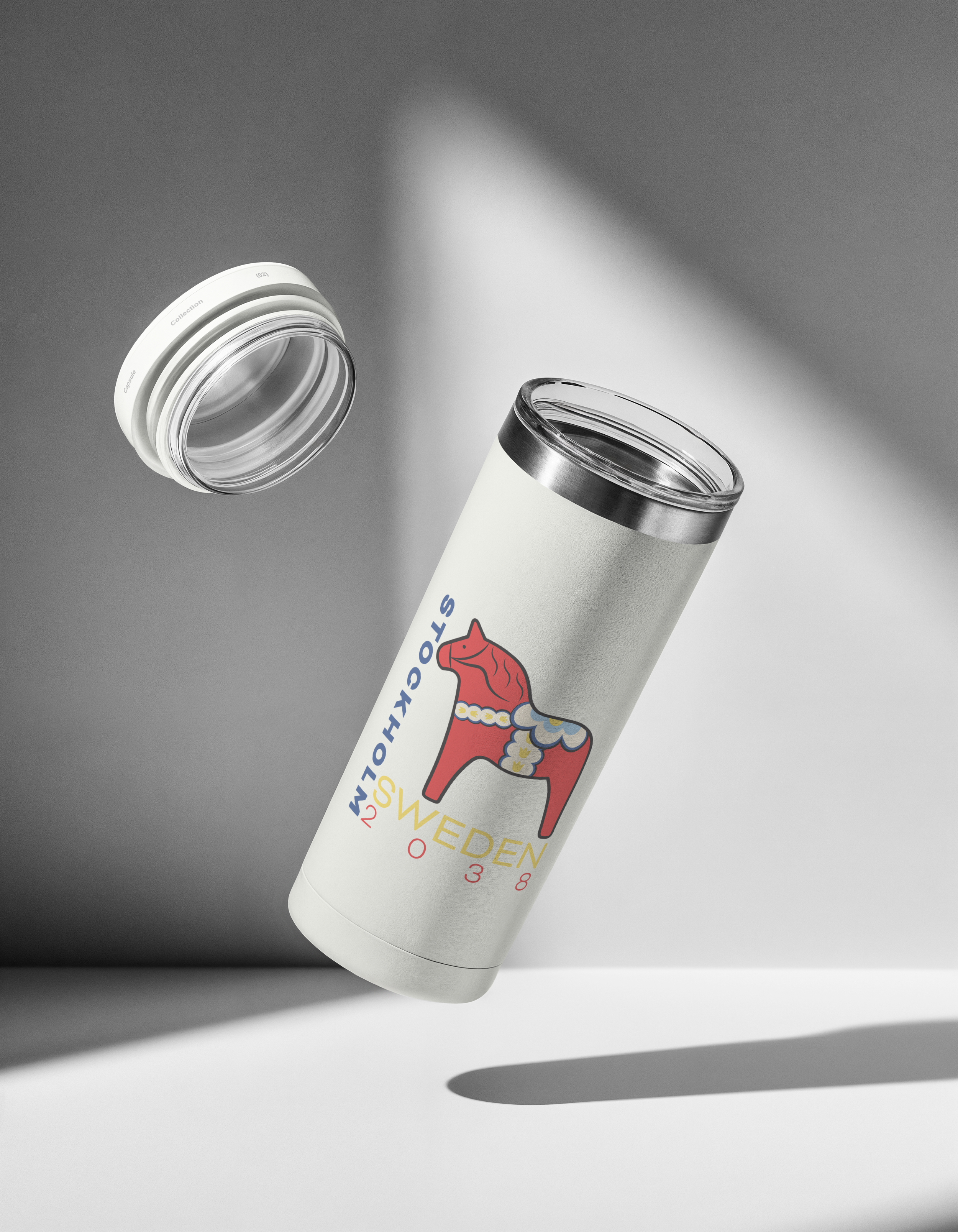
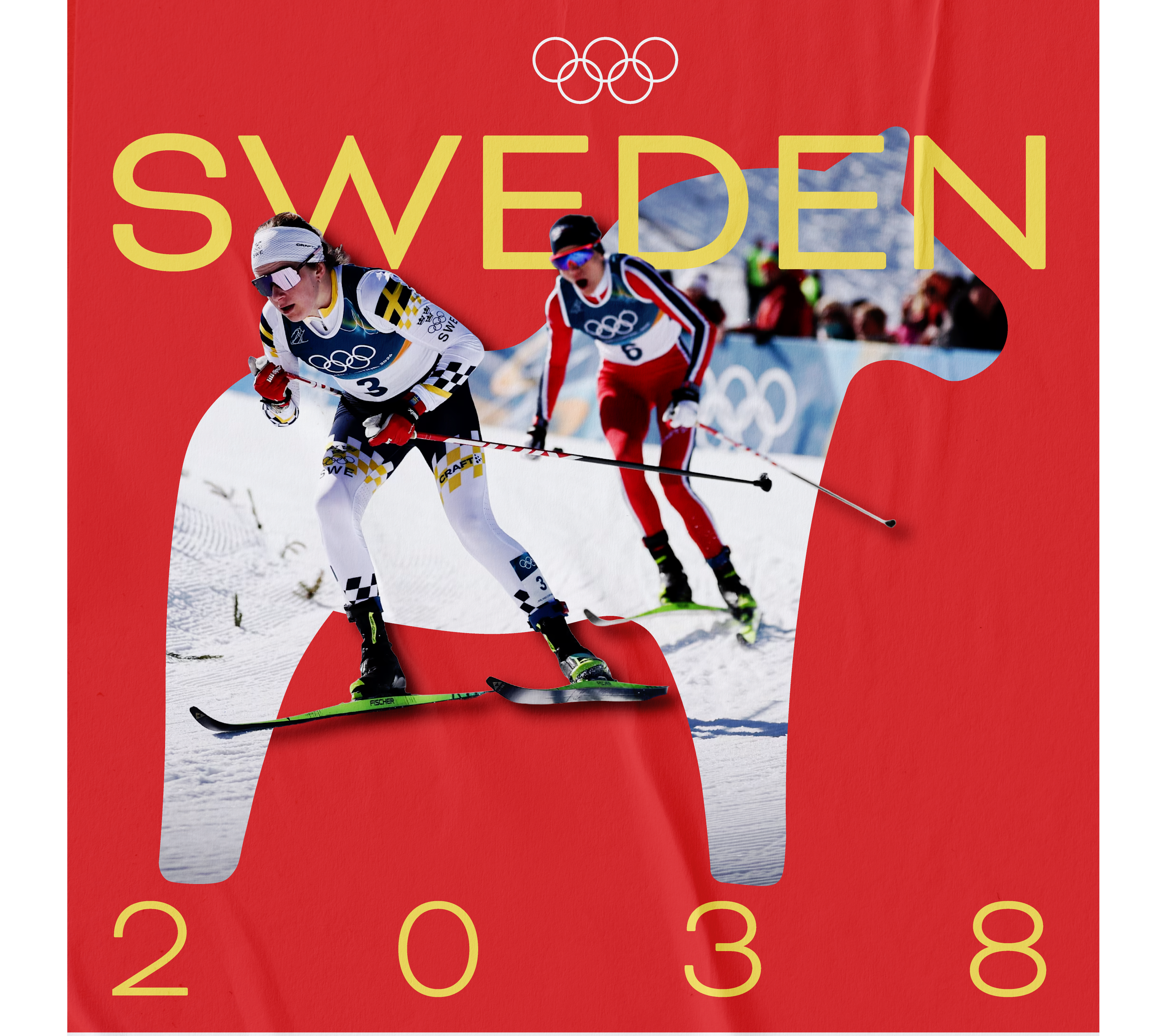
Beyond the logo itself, I considered how the identity could extend across a full Olympic system, including merchandise and promotional materials. The bold shape of the horse and the flexible decorative elements allow the branding to expand easily into icons and supporting graphics. This made the concept feel practical as well as visually engaging.

Overall, this project was an opportunity to combine cultural research with strategic branding. It challenged me to create something that felt meaningful, functional, and visually distinctive on a global scale. The final result is one of my favorite projects because it reflects both strong conceptual thinking and my growth in creating cohesive identity systems.